WUC


Scope of work
Brief
WUC, the World Utilities Congress, is a global platform where the stewards of water and energy systems come together to address the challenges and opportunities defining both sectors. The brief was to develop a visual identity system that could carry that weight: one rooted in the congress's subject matter, coherent with the WUC logo, and capable of communicating collaboration and progress at a genuinely global scale.
Strategy
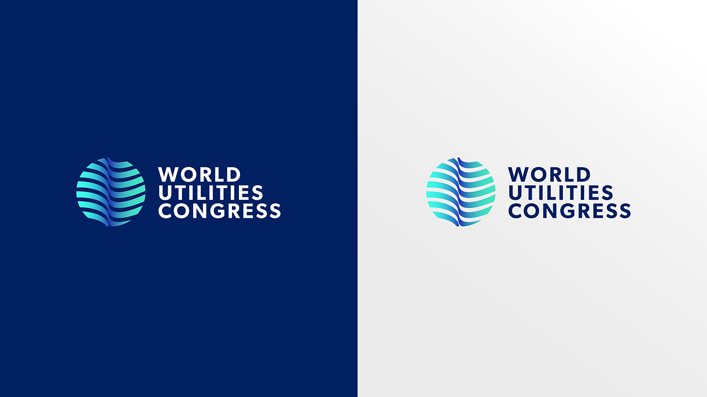
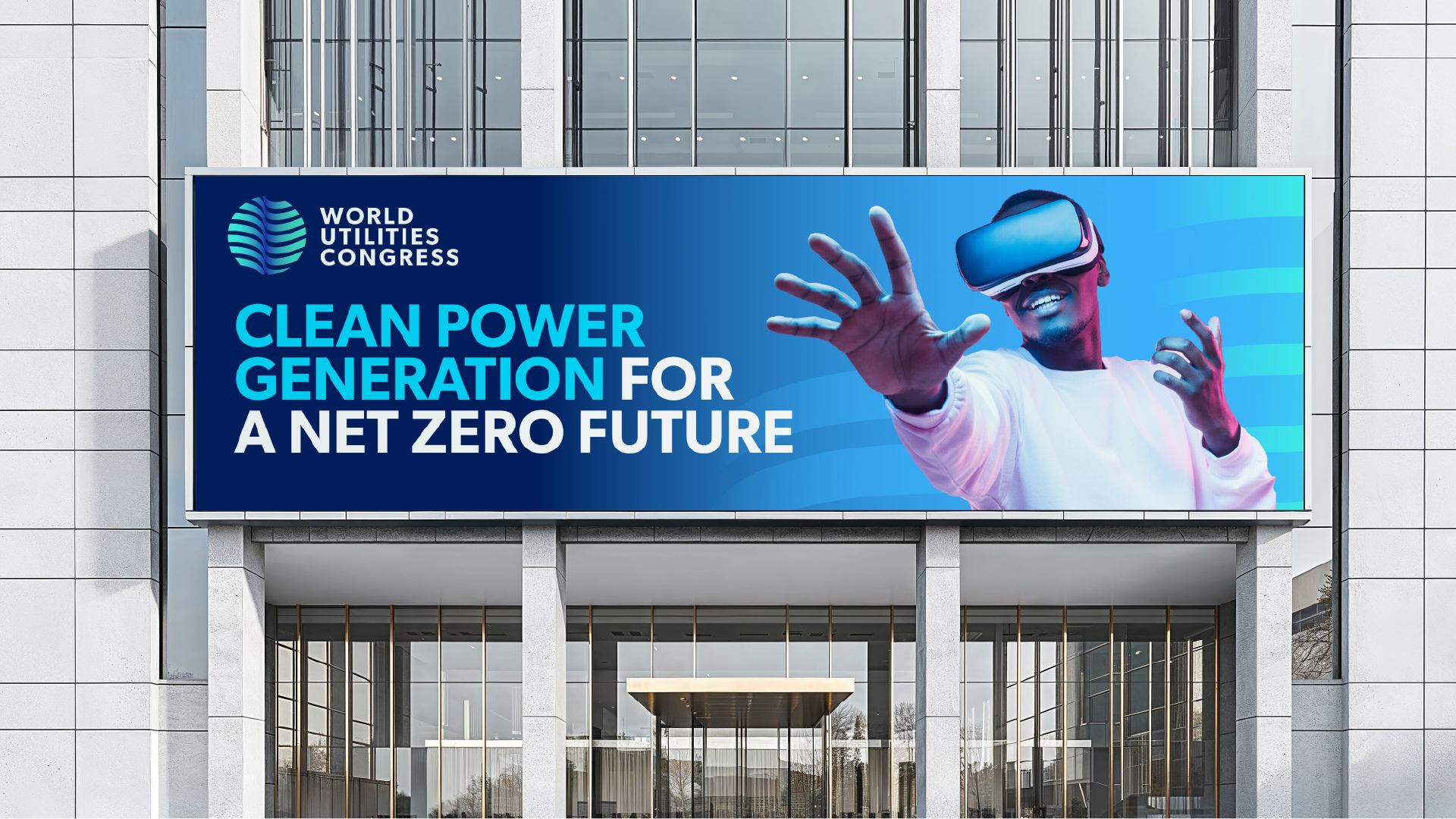
Utilities are easy to take for granted precisely because they work. Water flows. Power runs. The strategic opportunity was to build a brand identity that made those invisible systems visible and gave the congress a visual language that felt as dynamic and interconnected as the infrastructure it convenes around. The WUC logo provided the starting point: the circle, the globe, the suggestion of continuous movement. The task was to build a complete graphic world from that foundation.
Creative
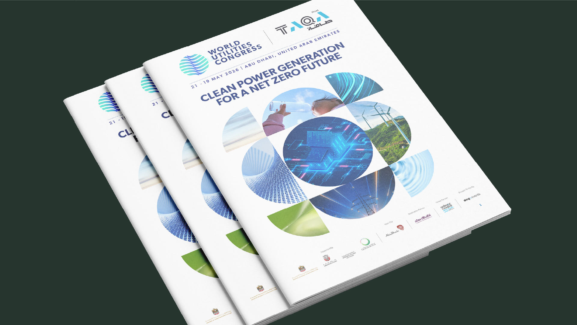
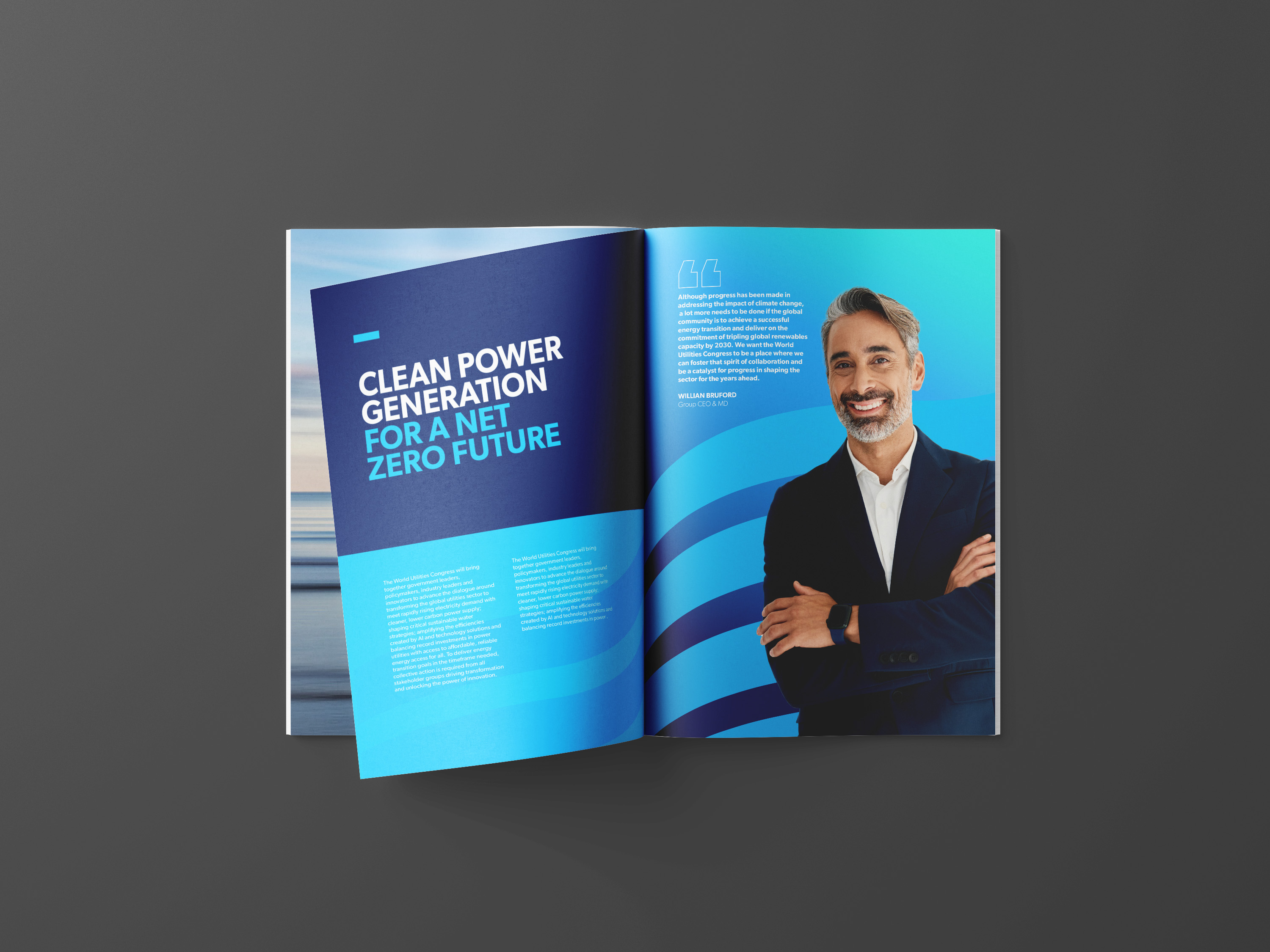
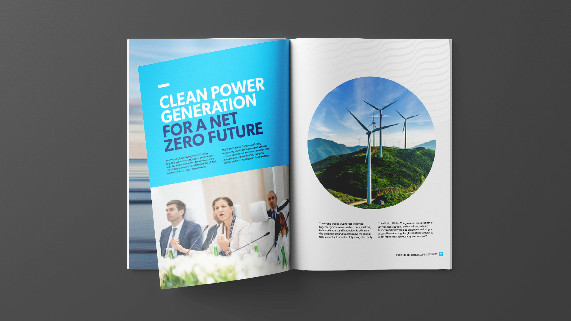
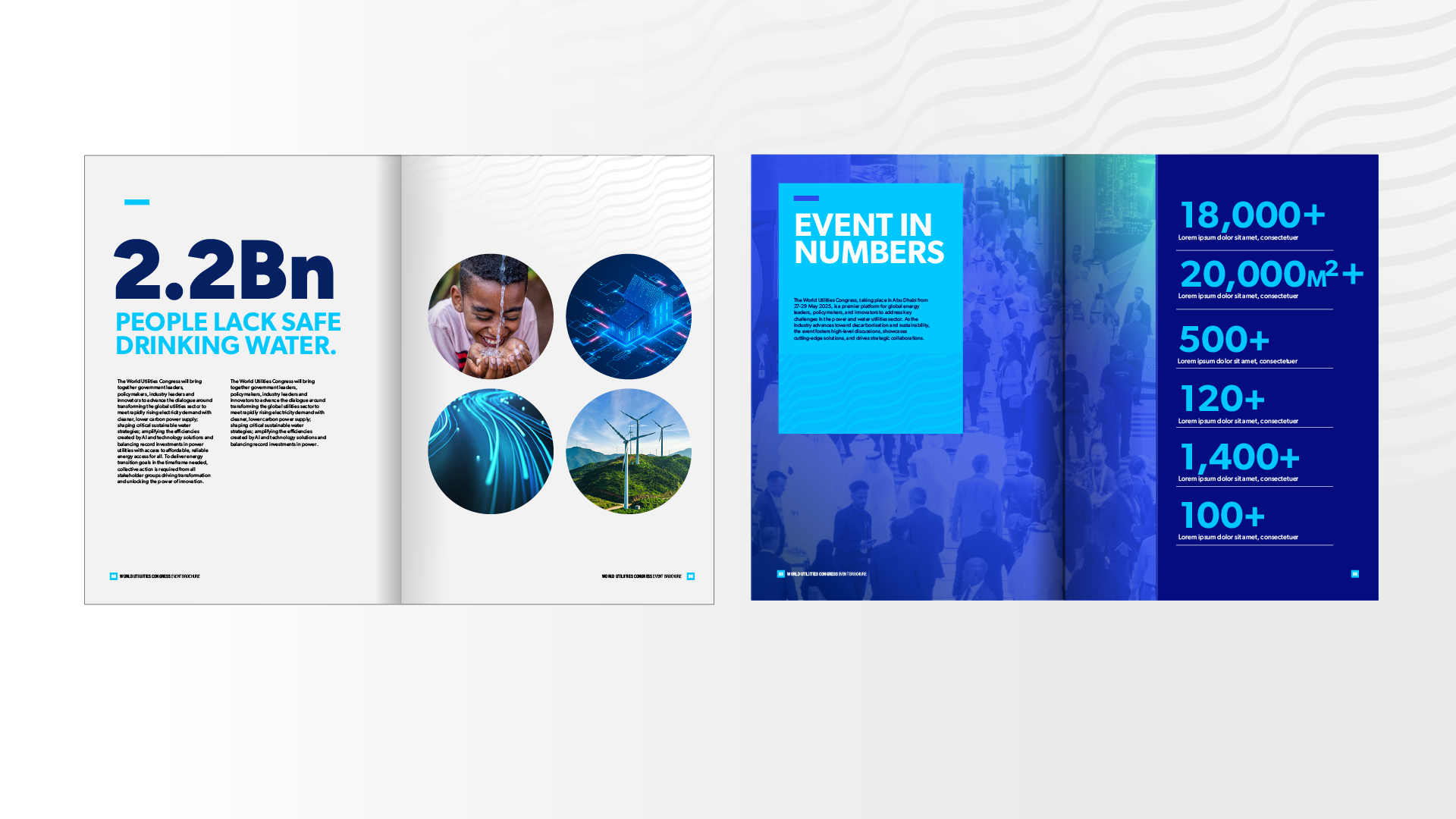
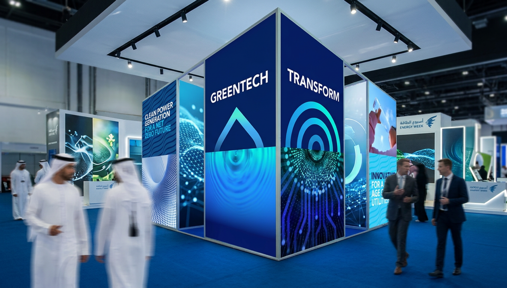
The identity draws its visual vocabulary directly from the subject matter. Water ripples, droplets, energy waves, and circular technology forms became the building blocks of a graphic system that is both immediately legible and quietly rich in meaning. Every element references the interconnected systems at the heart of the WUC agenda, without feeling illustrative or literal.
The circle does the heavy lifting throughout. It carries multiple readings simultaneously: the globe, the WUC marque, the idea of unity, the notion of infinite flow, and the suggestion of resources moving continuously through interconnected systems. It grounds the brand in nature and in innovation without having to choose between the two.
Results
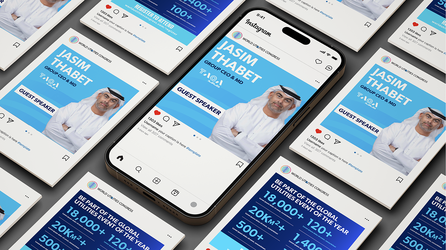
A visual identity that gives WUC the presence and coherence its global ambition demands. A system built to flex across every format the congress requires, with a graphic language rooted deeply enough in its subject matter to mean something, and distinctive enough to be remembered.
Let’s build your brand’s next chapter together.


