
ADIPEC branded campaign

Scope of work
Brief
ADIPEC is not a brand that needs an introduction. The world's largest annual energy conference and exhibition, it sits at the centre of the global energy conversation and has done for decades. But the conversation has changed. With the industry committing to carbon neutrality by 2050 and the energy transition accelerating on every front, a brand built for a different era of the sector needed to move with it. DMG brought Karak in to refresh ADIPEC across all touchpoints, repositioning it as a brand that leads towards cleaner energy rather than simply reflecting the industry as it was.
Strategy
The challenge with refreshing a globally recognised brand is knowing what to keep and what to evolve. ADIPEC's equity was real and hard-won. The task wasn't to reinvent it but to bring it forward, retaining the authority and recognition it had built while giving it the visual language to credibly represent an industry in transformation. Every creative decision needed to signal progress without abandoning the brand's heritage.
Creative
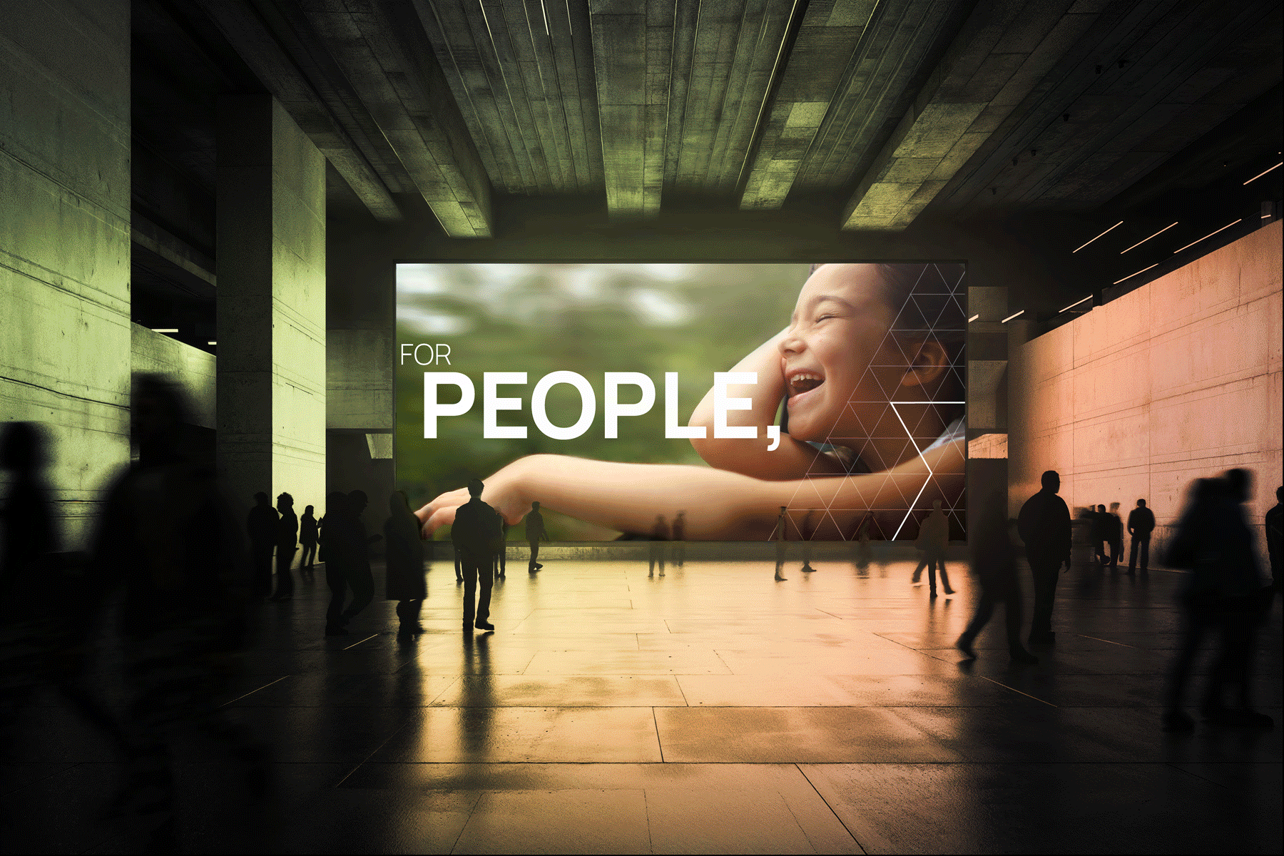
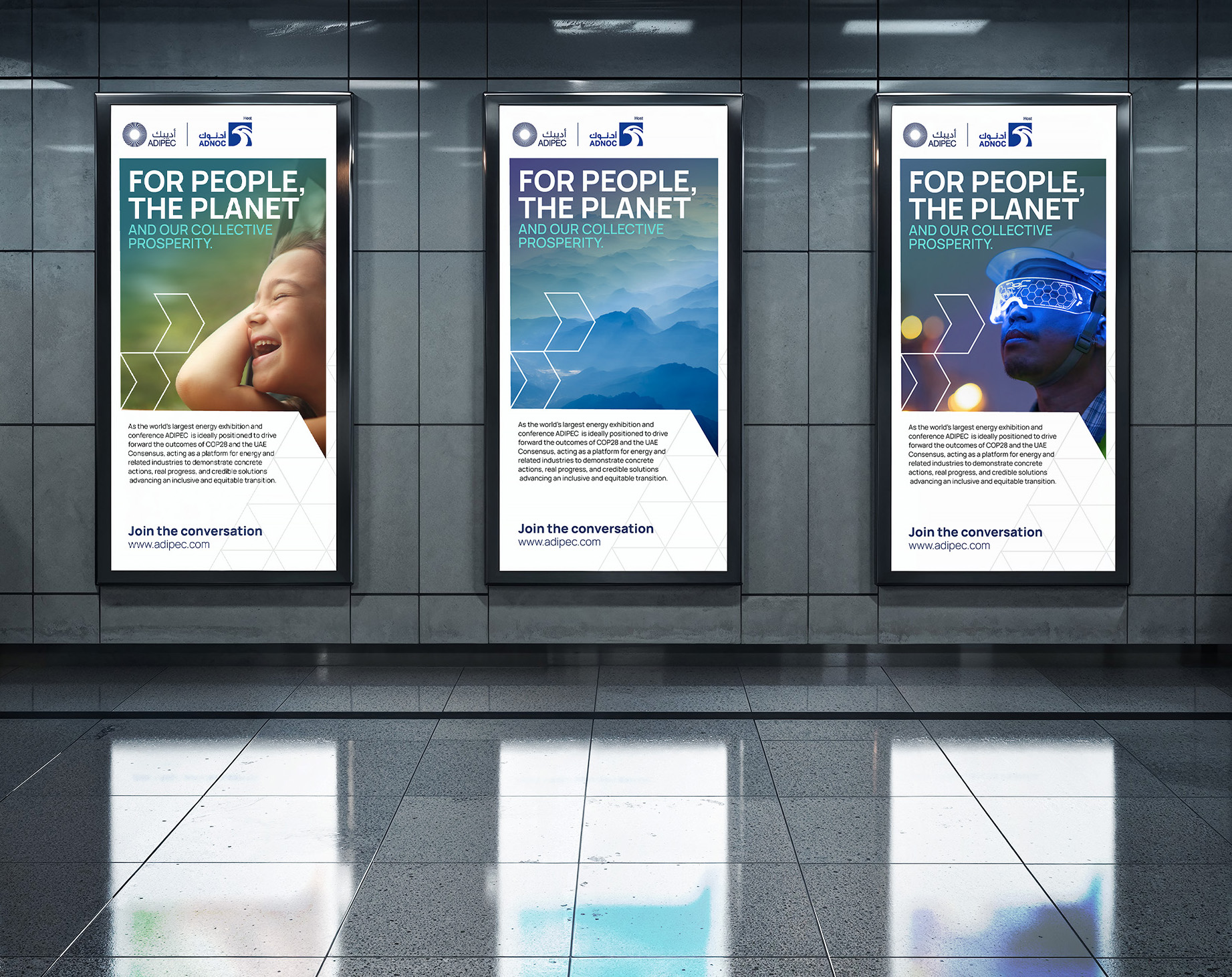
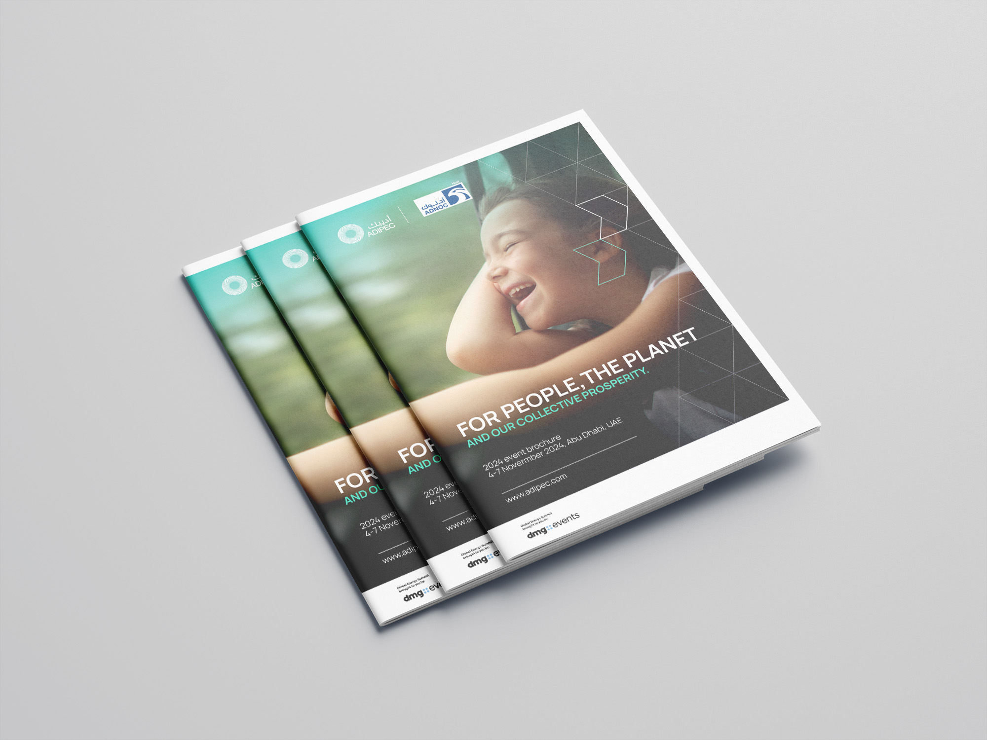
The refresh centred on two core elements. A lighter, fresher colour palette moved the brand away from the visual conventions of traditional energy sector identity, bringing a sense of openness and forward momentum. A chevron-style supergraphic was introduced as the brand's defining graphic device, a symbol of direction and progress that could carry meaning across every format and scale.
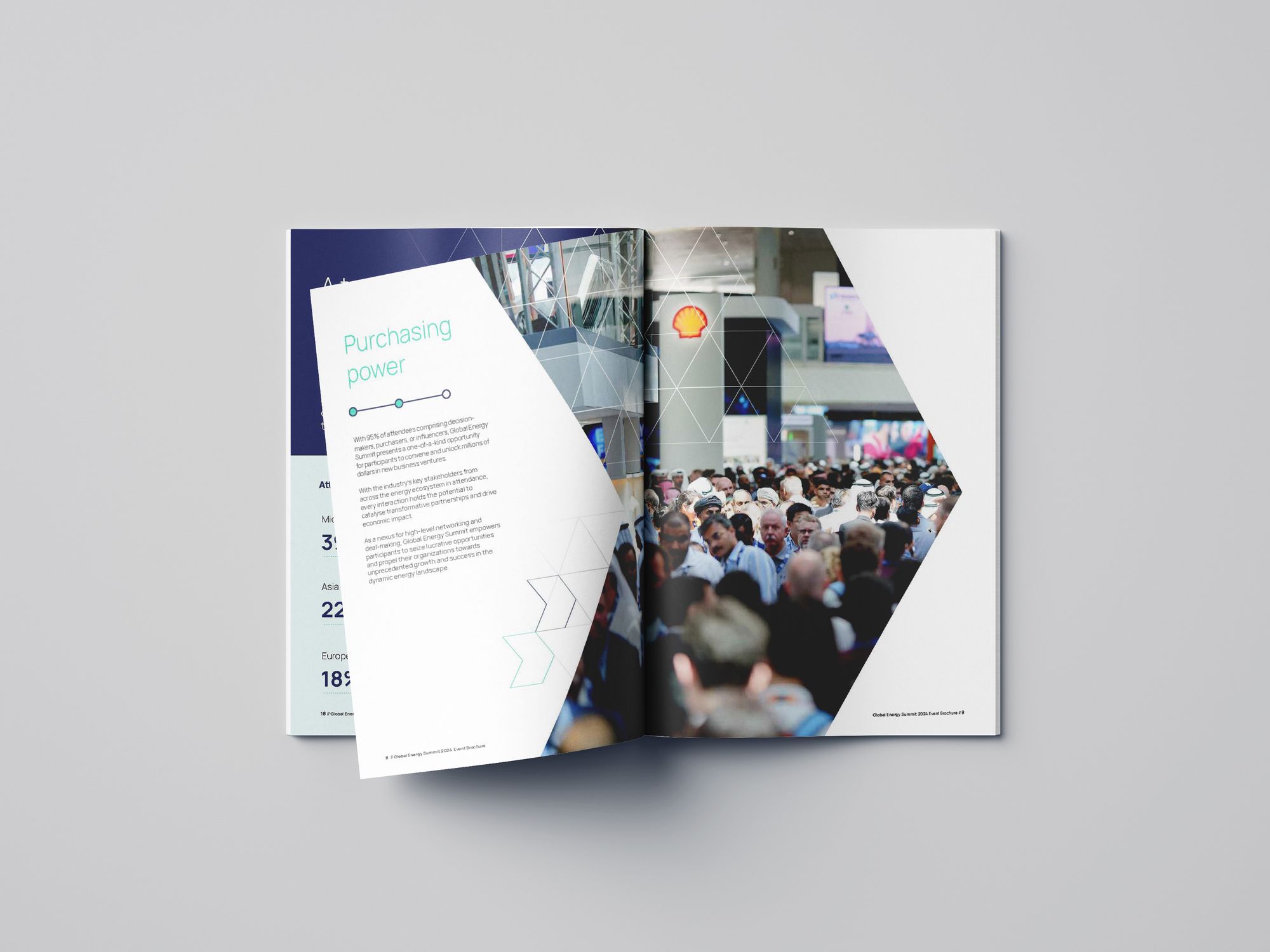
The resulting brand guidelines were built for the full complexity of an event of ADIPEC's size, from large-format on-site vinyl installations to the compressed demands of digital and mobile applications. Consistency at every scale was non-negotiable.
Results
A legacy brand repositioned for the next chapter of the energy industry. ADIPEC now shows up with the visual confidence to lead the conversations it convenes, carrying a refreshed identity that reflects where the sector is heading rather than where it has been.
Let’s build your brand’s next chapter together.


